import numpy as np
import matplotlib.pyplot as plt
from sklearn.linear_model import LinearRegression
from sklearn.metrics import mean_squared_error, r2_score
import seaborn as sns

# Generate synthetic data for regression problem
np.random.seed(42)
X = np.random.rand(100, 1) * 10 # Features (inputs)
y = 3*X.ravel() + np.random.randn(100)*3 # Target variable with some noiseUnderfitting: Detection Using Training Metrics & Visualizations
Introduction
In machine learning, underfitting occurs when a model is too simple to capture the underlying patterns of the data it’s trying to learn from. This results in poor performance on both training and test datasets. Detecting underfitting early can help improve your models by guiding you towards more complex architectures or better feature engineering techniques. In this article, we will explore how to detect underfitting using training metrics and visualizations with Python code examples.
Training Metrics for Underfitting Detection
To identify if a model is underfitting, it’s essential to monitor its performance on the training data over time. Two key metrics can help in this process: accuracy (for classification problems) or mean squared error (MSE) and R-squared (R²) for regression tasks.
Accurcuacy (Classification Problems)
For a binary classification problem, the model’s accuracy is calculated as follows:
accuracy = (true_positives + true_negatives) / total_samplesA low training accuracy indicates that the model may be underfitting.
Mean Squared Error & R-squared (Regression Problems)
For regression problems, we use MSE and R² to evaluate performance:
Mean Squared Error (MSE):
mse = np.mean((y_true - y_pred)**2)A high MSE indicates that the model’s predictions are far from the true values, suggesting underfitting.
R-squared:
R² measures how well the regression line approximates the real data points. An R² close to 0 suggests a poor fit and potential underfitting.
r_squared = 1 - (np.sum((y_true - y_pred)**2) / np.sum((y_true - np.mean(y_true))**2))Visualizing Underfitting with Python Code Examples
To better understand underfitting, let’s visualize it using a simple linear regression example in Python. We will use the sklearn library to create an overly simplistic model and plot its performance metrics.
First, install necessary libraries:
pip install numpy matplotlib scikit-learn seabornNow, let’s generate some synthetic data for our regression problem:
Next, we’ll fit a simple linear regression model and calculate its MSE and R²:
# Fit the model
model = LinearRegression().fit(X, y)
y_pred = model.predict(X)

# Calculate metrics
mse = mean_squared_error(y, y_pred)
r2 = r2_score(y, y_pred)
print("MSE:", mse)
print("R²:", r2)
MSE: 7.259261075703481
R²: 0.9081437156468248Finally, let’s visualize the data and model performance using seaborn:
import seaborn as sns
# Plotting synthetic data points
plt.figure(figsize=(10, 6))
sns.scatterplot(x=X.ravel(), y=y, color='blue', label="Data Points")

# Plotting the regression line
sns.lineplot(x=X.ravel(), y=model.predict(X), color='red', label="Regression Line")
plt.title("Underfitting Example: Linear Regression on Synthetic Data")
plt.legend()
plt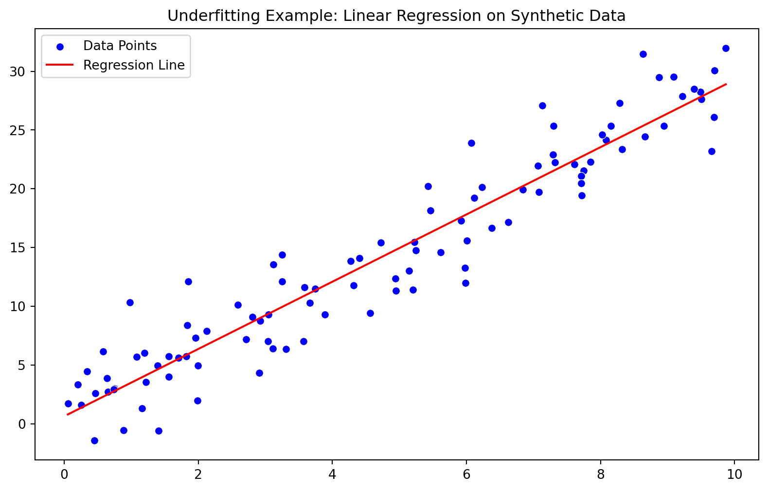
In this example, the model’s MSE and R² values indicate that it is underfitting the data:
- The regression line does not capture the underlying pattern of the synthetic dataset well.
- The high MSE value suggests a poor fit to the true target variable.
- The low R² value indicates that our model explains only a small portion of the variance in the target variable.
Conclusion
Detecting underfitting is crucial for improving machine learning models’ performance. By monitoring training metrics such as accuracy, MSE, and R², we can identify when a model may be too simple to capture the underlying patterns in our data. Visualizations using Python code examples help us better understand these concepts and guide us towards more complex architectures or feature engineering techniques that could improve our models’ performance.